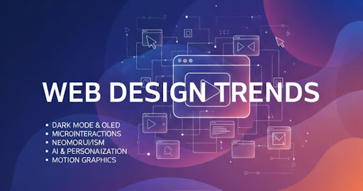
Great web design goes beyond looks, it’s about creating experiences that capture attention and keep people coming back. These web design trends are redefining how users interact online, blending creativity, technology, and strategy to turn ordinary websites into unforgettable digital experiences. From bold visuals and smooth animations to user-first layouts and immersive storytelling, each trend is designed to make your brand stand out. If you’re ready to elevate your site and inspire your audience, these ideas are where innovation meets impact.
Core Aesthetic & Visual Trends
Your website’s look and feel are the first things a visitor notices, making a strong first impression that can last. The most popular modern web design trends are moving away from cold, generic layouts toward looks that are full of personality and warmth. Here are the core visual styles shaping the web.
Expressive Typography & Color
This trend is all about using fonts and colors to show off your brand’s personality. We’re seeing more expressive typography, where a font isn’t just for reading it’s part of the art. This includes bold variable fonts that look great and load fast, and even maximalist typography where words become the main visual. These are paired with warm, inviting color trends that use high-contrast type pairings to make text pop.
It matters because it helps you stand out and connect with visitors emotionally. Use this style if your brand is creative and bold. You might skip it for very traditional or formal businesses where a standard look is expected.
Quick Tip: Swap one headline on your site to a new, character-rich font from Google Fonts to see how it changes the mood.
The Human Touch: Organic & Sketchbook Aesthetics
Websites are starting to feel more human again. The sketchbook aesthetic uses organic shapes, imperfect lines, and hand-drawn elements to create a sense of authenticity. Instead of perfectly straight lines, you’ll see flowing curves. Instead of stock photos, you’ll find charming custom illustrations.
This approach builds trust by showing there are real people behind the screen. It’s perfect for small businesses, artists, and anyone wanting to feel more relatable.
Quick Tip: Add a hand-drawn icon or a squiggly underline to a section of your site to instantly add a touch of personality.
Refined Brutalism & Anti-Design
Brutalism and anti-design are rebellious website design trends that break all the rules on purpose. Think raw, unpolished layouts, basic fonts, and clashing colors. It’s a bold style that feels honest and direct, pushing back against the look-alike templates we see everywhere.
This trend is powerful for grabbing attention and showing confidence. It works great for art projects, fashion brands, or events trying to attract a younger, design-focused crowd. However, it’s not a good fit for businesses that need to build conventional trust, like a bank or a doctor’s office.
Quick Tip: Try a stark, black-and-white color scheme on a single landing page with one bold accent color to test the waters.
Interaction & Motion: Bringing Your Site to Life Responsibly
Thoughtful motion design can make your website feel alive, responsive, and much more interesting to use. But, the trick is to use it with purpose, not just for decoration. The goal is to help your visitor, not distract them.
Purposeful Micro-interactions & Animations
Micro-interactions are the tiny animations that happen when you do something on a site. Think about the little heart that bursts when you “like” a post, or a button that wiggles slightly to get your attention. These are some of the most common micro-interactions UX examples for websites, and they make a big difference.
These little movements matter because they give you instant feedback, confirming your action was successful. This makes the website feel more responsive and satisfying to use. For example, when you complete a form and a green checkmark animates in, you know for sure that it went through. To see if they’re working, you can track if more people complete actions on pages where you’ve added helpful micro-interactions.
Immersive Scrolling Animations
Scrolling animations use your scrolling action to make things happen on the page. As you scroll down, text might fade into view, images can slide into place, or different parts of a story can unfold. A popular version of this is the parallax effect, where the background of a page moves at a different speed than the content in front, creating a cool sense of depth.
This technique is fantastic for storytelling and can keep visitors engaged and scrolling to see what comes next. It turns a simple page into a more dynamic and memorable journey. You can measure its success by looking at how far people scroll down the page if they’re scrolling further, the animations are likely keeping them hooked.
A quick note on performance: While these effects are fun, it’s important to have clear performance budgets. Too many animations can slow down your site and hurt your Core Web Vitals (Google’s measures for a good user experience). Your animation budgets should be modest, ensuring the site stays fast and smooth for everyone.
Which Trends Actually Boost Conversions?
While many trends are about looking cool, some have a secret superpower: they can directly increase your website’s conversions. That means more sales, sign-ups, or whatever goal you have. If you want to see a real return on your design efforts, focus on these three high-impact UI/UX trends.
Trend 1: Thumb-Friendly Mobile Navigation
Most of your visitors (over 60%!) are likely browsing on their phones, probably holding it with one hand. Thumb-friendly mobile navigation patterns make it super easy for them to tap where they need to go without stretching their fingers. This means placing important buttons like the menu, search bar, or “Add to Cart” at the bottom of the screen where thumbs can easily reach them.
This simple change reduces frustration and makes your site a breeze to use on the go. At bosthelp, we see this as one of the quickest wins for any business.
- Metric to watch: A jump in your mobile conversion rate.
Trend 2: Data Visualization for Clarity
Do you have complicated pricing or a multi-step process? Don’t make your visitors read a novel to understand it. Use data visualization to turn confusing information into simple, engaging visuals. Think of a colorful chart instead of a boring table, or an interactive slider instead of a long list of features. There are many great data visualization examples for websites that make complex ideas feel simple.
This helps people understand your value in seconds, not minutes, which speeds up their decision to buy.
- Metric to watch: A lower bounce rate on your pricing or services pages.
Trend 3: Smart Video Integration
A fantastic smart video strategy for homepage success is to replace that static main image with a short, silent, auto-playing video. This could be a quick demo of your product in action or a smiling customer giving a testimonial. The key is to keep it short (under 15 seconds) and focused on communicating one powerful idea.
Video builds trust and shows your value much faster than words alone, grabbing attention right away.
- Metric to watch: An increase in how long visitors stay on your homepage.
Structure, Performance & Accessibility: The Unseen Trends
Some of the most powerful trends are the ones your visitors will never see. These behind-the-scenes heroes work quietly to make your website faster, easier to use for everyone, and smarter. They are the foundation of a truly great user experience.
Sustainable Web Design
Sustainable web design is about creating websites that are kinder to the planet. It focuses on making your site super-efficient so it uses less energy. This is done through smart page speed optimization, like compressing images and using cleaner code. A faster site isn’t just good for the earth, it’s also something Google loves and rewards with better rankings.
This matters because a speedy site makes visitors happy and helps your business grow.
- Easy Action: Use a free online tool to shrink the file size of your images before uploading them.
- Metric to Watch: Your page load time and Core Web Vitals score in Google Page Speed Insights.
Accessibility-First Adoption
Great design is for everyone. Accessibility in web design means making sure people with disabilities can use your website without any barriers. This isn’t just a nice idea, it’s essential for being inclusive. An accessibility checklist helps you remember key things, like adding descriptions for images (alt text) and making sure your site can be navigated with a keyboard.
This is crucial because it opens your website to a wider audience and shows that you care about every user.
- Easy Action: Use a free color contrast checker online to make sure your text is easy to read against its background.
- Metric to Watch: A decrease in your bounce rate, as more people are able to navigate and use your site successfully.
Content Structure for AI Summaries
How you organize your content matters more than ever. Using clear, logical structured content with a main heading (H1) and subheadings (H2, H3) helps both people and search engine bots understand your page. Block-based layouts are great for this, as they create clean, scannable sections.
This is important because search engines like Google are using AI to give direct answers. A well-organized page has a much better chance of being chosen as the source for these summaries, giving you a huge visibility boost.
Make Your Website a Trendsetter
How Do I Test a Trend Without Breaking My Site?
Jumping on a new trend can feel scary. What if it slows down your site or, even worse, breaks something? The good news is you don’t have to risk it. You can try out new ideas in a safe, smart way to see what works before you commit. It’s all about testing.
The Low-Lift Pilot Test
A pilot test is like a mini-experiment. Instead of changing your whole website, you try a new trend on just one page or even a small part of a page. This gives you real data with very little risk. It’s a simple approach we often recommend at bosthelp to make changes with confidence.
- 60-Minute Test Example: Want to try expressive typography? Pick one of your popular blog posts. Change just the main headline and a few subheadings to a new, interesting font. Publish the change and watch what happens.
Always make sure you have a backup of your site before you start, just in case!
Key Metrics to Measure Success
How do you know if your test is working? You need to track the right numbers. Don’t just ask, “Does it look better?” Instead, ask, “Does it perform better?”
For your test, watch these three things for a week or two:
- Engagement: Do people stay on the page longer or scroll further down?
- Performance: Does the page still load quickly? (Check your Core Web Vitals).
- Conversions: Are more people clicking your call-to-action button or filling out your form?
If you see positive results in these areas, you know the trend is a winner.
Using A/B Testing Tools
For a more advanced approach, you can use A/B testing. This sounds technical, but the idea is simple. A special tool shows your original page to half of your visitors (Group A) and the new page with the trend to the other half (Group B).
The tool then automatically tracks which version gets better results. It’s the most reliable way to know for sure if a design change is helping or hurting your goals. Many platforms have these tools built-in, making it easier than ever to test your creative ideas safely.
Conclusion
Great design goes beyond looks, it’s about creating meaningful, memorable experiences. By embracing web design trends that turn ordinary sites into exceptional experiences, businesses can connect emotionally with users, tell compelling stories, and guide visitors naturally toward action. Whether it’s through interactive layouts, immersive visuals, or seamless navigation, these trends redefine how users see and feel your brand. Stay ahead of the curve, and your website won’t just impress, it will inspire.
FAQs
Trends like minimalism, 3D visuals, dark mode, interactive layouts, and personalized user journeys are leading the way in modern design.
They focus on simplicity, accessibility, and engagement helping users navigate easily and enjoy every interaction.
Yes, trends can be tailored to fit any brand from eCommerce and tech startups to creative portfolios and corporate sites.
Ideally, every 2 to 3 years or whenever new design innovations and user behaviors emerge that could enhance performance.
Absolutely. Fresh, user-friendly design builds credibility, keeps visitors engaged, and can significantly boost conversions.